

#09 – A making of cc-tapis
A behind the *screen* look at what we looked at when designing cc-tapis.com
cc-tapis is a contemporary rug company based in Milan whose catalog features a wide selection of rugs created in partnership with contemporary designers and brands.
At the core of the company’s identity lies the mastery of its rug-making processes and a playful and forward-thinking attitude toward exploring new aesthetics and visual narratives.
The website

We created a digital platform for the company to showcase its products, manage its catalog, and tell its story. The website features various tools to meet multiple needs.
The Pagebuilder allows the company to build pages with engaging content across multiple areas of the website, such as Collections, Stories, Creatives and more.
The Explore page acts as a visual guide to the company’s content, creating interesting flows and allowing the discovery of their products through images.
The Stocklist streamlines B2B operations, enabling businesses and professionals to view and order rugs directly from the catalog.
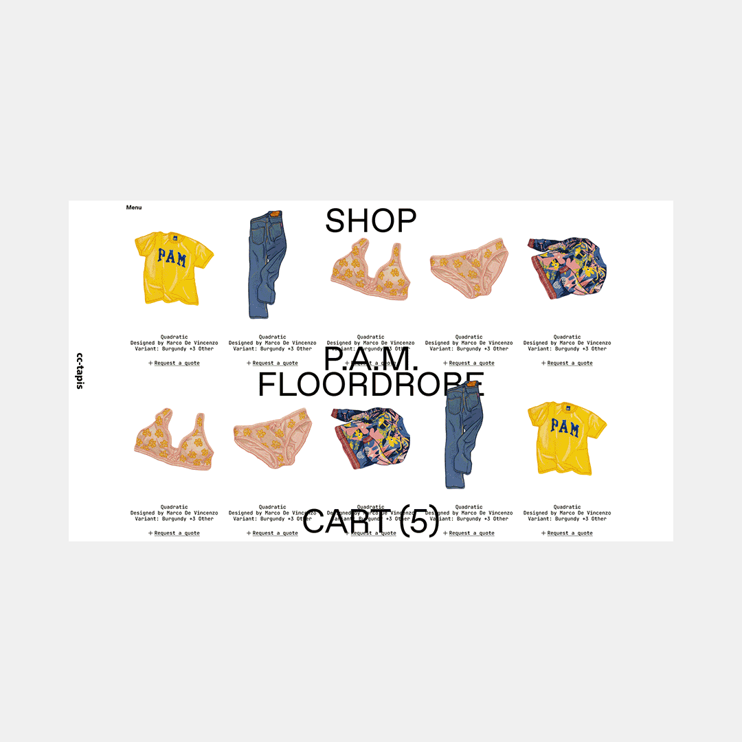
The Shop serves as a storefront for retail customers, offering a curated selection of rugs with a full e-commerce experience.
Inspirations
When designing the new cc-tapis digital language and design system, we focused our research on a few key elements that caught our attention:
The watermark-like logo used in labels, product wrappings and packaging
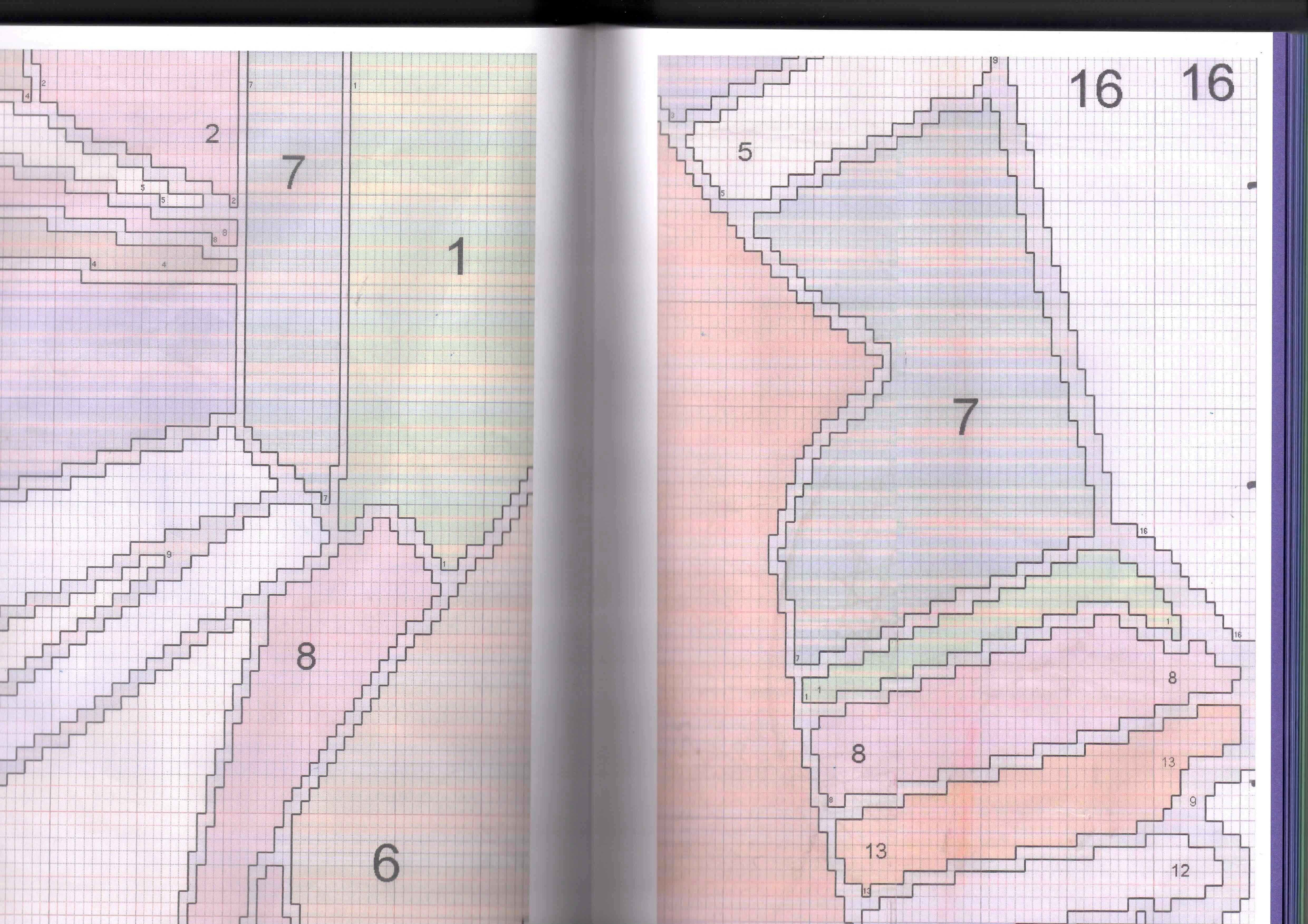
Various graphic diagrams that guide the weavers through the knotting process
The unique freeform rugs’ shapes
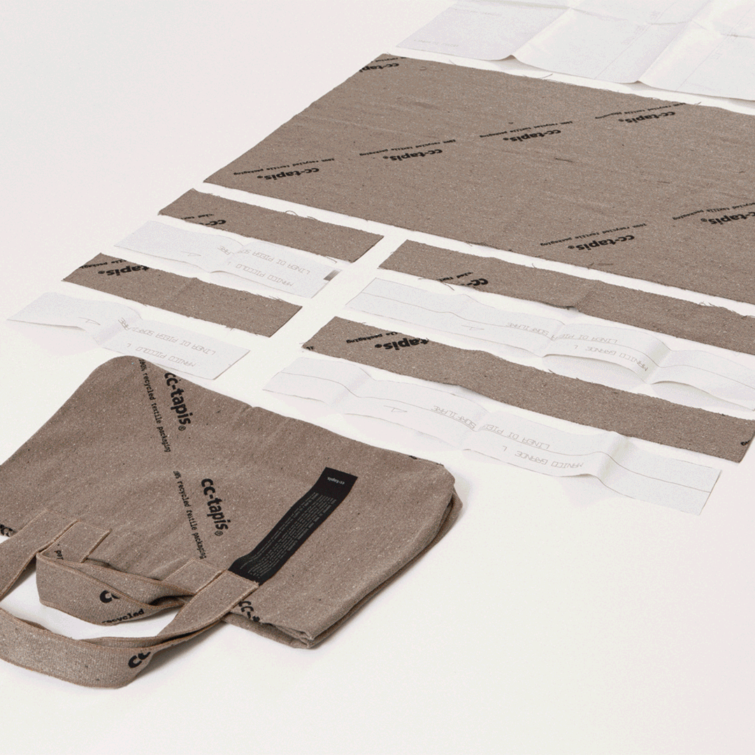
Additionally, the underlying playfulness of the company’s approach led us to explore a visual language that could balance something technical yet colourful and fun, contemporary yet timeless, with a digital flair—a take on the pre-existing identity.
In particular, we explored the connection between the units of the weaving process and the digital design space—the knot and the rug, the bit and the file, the glyph and the font.
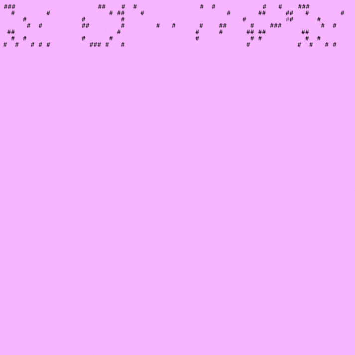
We examined digital spaces where these units were made more apparent, such as early communication technologies like Teletext and the early text-based internet, where limited resources led to crafty solutions for creating images and decorations.
Teletext
Teletext was an early system that displayed text-based information, like news and weather, on TV screens. It used unused parts of the TV signal, allowing viewers to access different pages by entering numbers. Known as Televideo in Italy, everyone using a television even into the 00’s can recall pressing the wrong buttons on the remote and entering Televideo by mistake, without knowing how to get out.
Typewriter & ASCII Art
The earliest form of conveying emotions through text characters dates back to 1982 when Scott Fahlman first suggested using a combination of characters to create the first smiley emoticon on a message board at Carnegie Mellon to distinguish serious posts from jokes. Fahlman proposed using :-) and :-( for this purpose, and the symbols caught on.

From Flora Fanny Stacey’s art—among the first created using the characters available on the typewriter in the late 1800s—to early text-based emoticons and internet art created using ASCII character encoding, people have continually found ways to overcome the limitations of machines.

Even today, receipt printers, for example, use simple text characters to create visual elements. Logos are often composed of basic symbols like slashes and dots, while barcodes and QR codes are printed using patterns of black and white bars. Printers also use characters such as asterisks and dashes to form borders, boxes, and dividers on receipts.

In the 1990s and 2000s, ASCII art flourished in internet culture, especially in chat rooms, forums, and emails, where bandwidth limits made it practical for sharing visuals; it also gained traction in gaming communities and software piracy, often appearing in NFO files and signatures until today.

The visual language
Together with Daniele and his team at cc-tapis, we decided to explore the aesthetic of text-based digital art and decorations, incorporating it into the design system we created for the website.
The need for a medium through which the company could communicate freely and directly with both businesses and consumers was the message—alerts, banners, pop-ups, and more. We began our design with these messages, which laid the foundation for the system's main components.
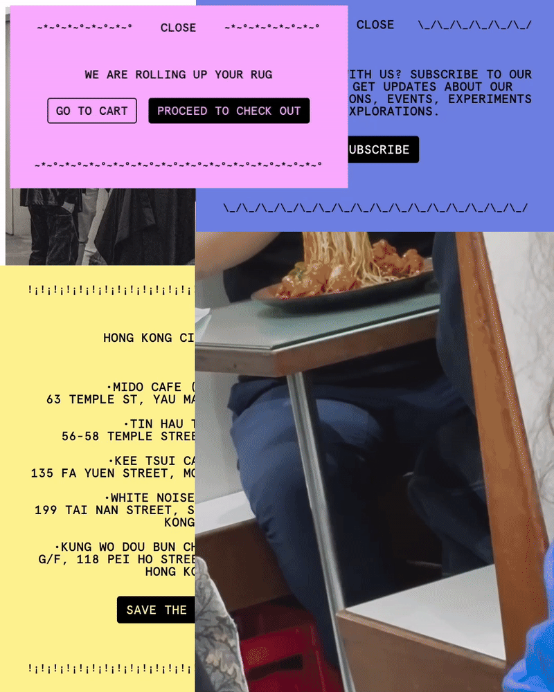
Every panel, from navigation and menus to filters, product page information, and the footer, reflects this exploration of shapes, colors, and typography, primarily inspired by the concept of stick-on product labels, but also by early communications technologies, receipts, and similar sources.
The main challenge we faced when designing cc-tapis’ website was creating a consistent design system that appeals to different audiences in different ways.

The website serves in fact as both a technical tool and a narrative tool. The technical elements, such as menus and panels, were designed with clarity and ease of use in mind, reflected in concise text with a monospaced font, recognizable buttons, selects, and text fields. These elements are often framed by backgrounds with long-form editorial pages featuring large images, videos and texts.
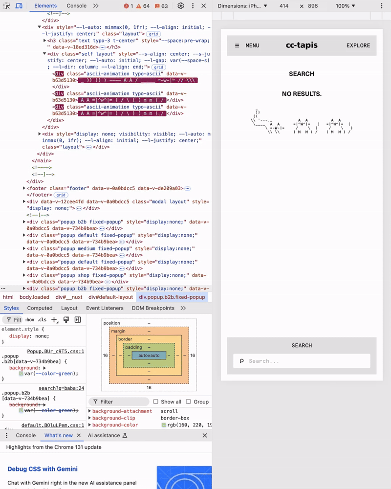
Ultimately we had a lot of fun putting together a selection of ASCII cats, snow-people and shopping carts and a memory game that occasionally pop up when browsing ^w^.
A text by Michele Sablone, Designer at Giga
We hope you enjoyed this dive into the making of cc-tapis’ digital platform.
If you want to learn more about upcoming projects from Giga you can also follow us on Instagram and check our website.
This is so great!