

#13 – True Unpredictability: behind the scenes of Camperlab’s new identity
Shedding its skin: how Camperlab’s new identity embraces transformation and unpredictability

I still remember a moment from my childhood, during one of those endless summers spent at my grandparents’ countryside home in northern Italy. I came face-to-face with a snake. I had spotted it twice from a distance, but one day as I walked through the courtyard, it appeared right in front of me, just a few centimeters away. I froze.
It was a black grass snake, completely still. We stared at each other for a few seconds before it darted away into the tall grass, lightning fast.
That image stayed with me through the years, there was something about the coldness of its gaze that fascinated me as much as it unsettled me. That memory resurfaced during one of our first brainstorming sessions in the studio, while discussing how to interpret Camperlab’s new identity.
During our visit to their headquarters in Mallorca, Emanuela (Art Director) and Lauri (Brand Director) kept repeating one word: sinister. The image of a reptile felt perfect: impossible to read in its eyes. The tension that arises from not being able to interpret the intentions of a creature (Is it going to flee? Is it afraid? Is it going to bite me? What is it thinking?) became the driving force behind the entire project. A silent, sinister presence. That feeling of being watched.
A new Camperlab
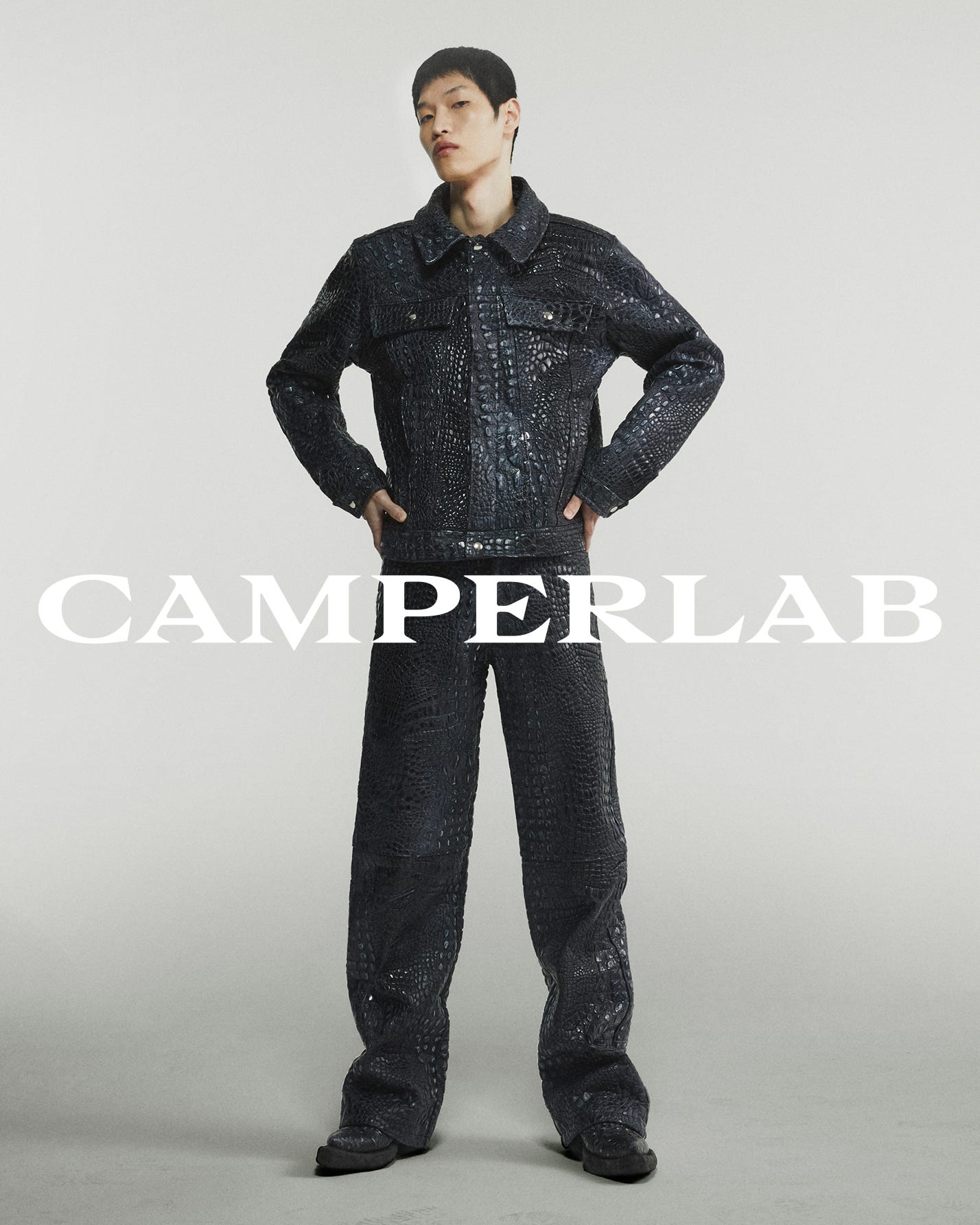
Camperlab is a Spanish brand founded in 2015 as Camper’s experimental and disruptive offshoot. Originally focused on footwear and known for its bold colors, unconventional shapes, and camp aesthetics, its mission has always been to subvert norms and provoke the status quo.
Since its relaunch under Achilles Ion Gabriel, it has embraced a bold, anarchic identity rooted in distortion, camp, and subversion. Our task was to translate that narrative into a visual system that would feel striking, symbolic, and unmistakably Camperlab.
The visual rebrand was part of a larger strategic shift, defined by specific goals:
Become a fashion house
Establish Camperlab within the high-fashion market, reinforcing its rebellious yet mature spirit and expanding beyond footwear, helping the brand becoming a broader fashion house.Differentiate from Camper
Build independent resonance in the fashion world by targeting conscious consumers and positioning as a stand-alone name.Find a new positioning
Reframe the brand’s role in the market by evolving its distinctive traits into leadership within a niche high-end fashion segment.
Reptiles, scales, pupils, claws
We collected countless images and ideas from the reptilian world, many of which inspired metaphors that deeply resonated with us. One of the most compelling was shedding skin, a powerful metaphor for transformation. Growing so much that you no longer fit into your former self. A visceral and intimate kind of renewal.
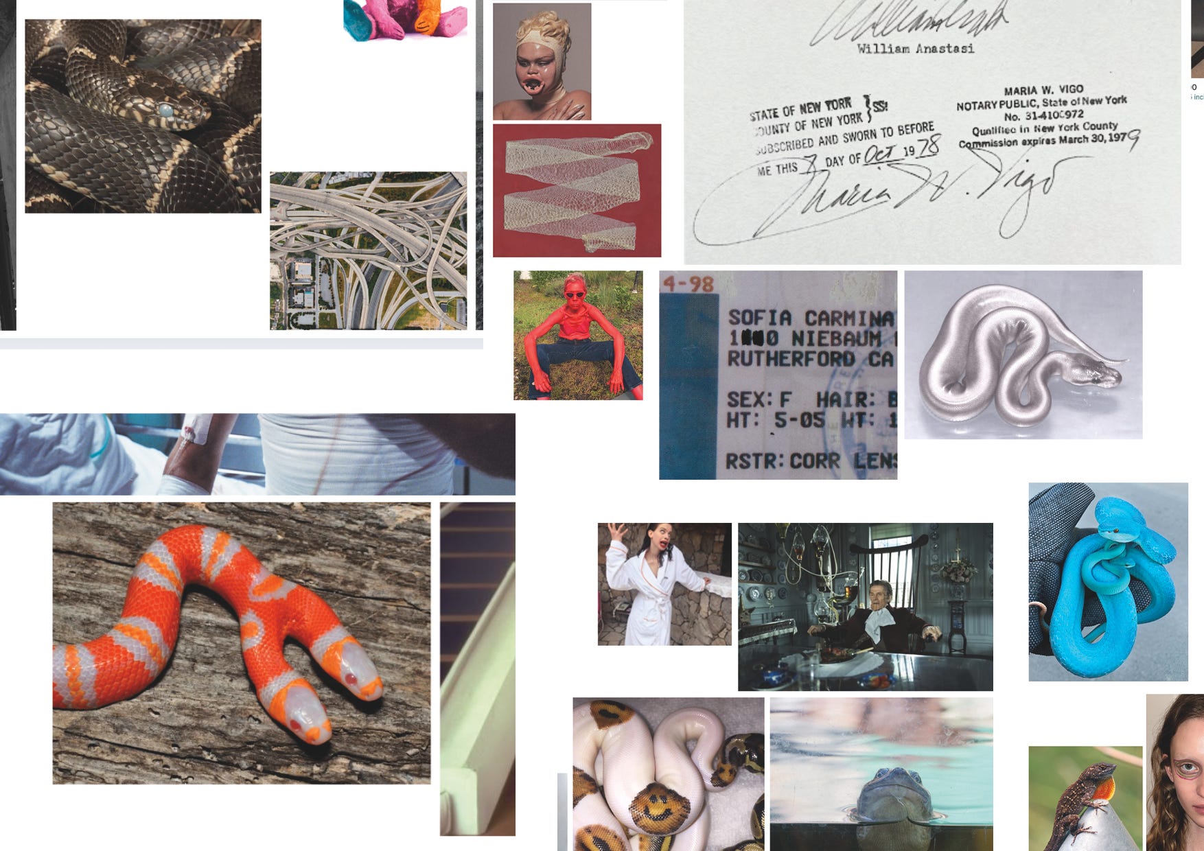
If Camperlab is shedding its old skin, what lies beneath? What new patterns emerge? Finding the answer was our goal, but designing an identity is never easy. It requires thought, experimentation, and iteration. How ironic should it be? How eclectic? What’s the right balance between minimal and bold?
In search of the letterform
Our work focused on creating the new logotype and monogram. The goal was to design a bold, unconventional mark that could embody the brand’s evolving, experimental spirit.
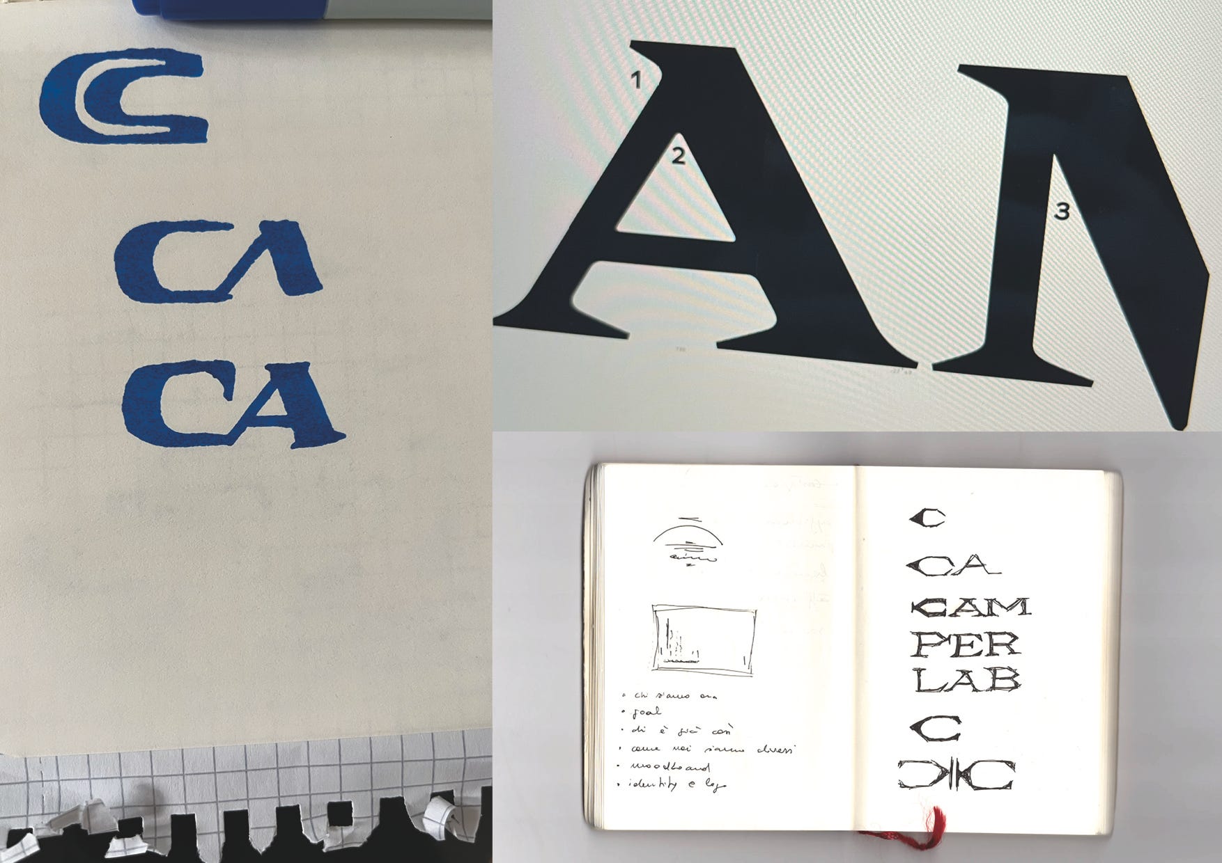
We started from a few essential principles. Above all, though it might sound obvious, the logotype had to be timeless. Rather than seeking balance, we aimed for tension, between classicism and modernity, in order to get a visual language that felt both fresh and familiar, evoking the heritage of high fashion.
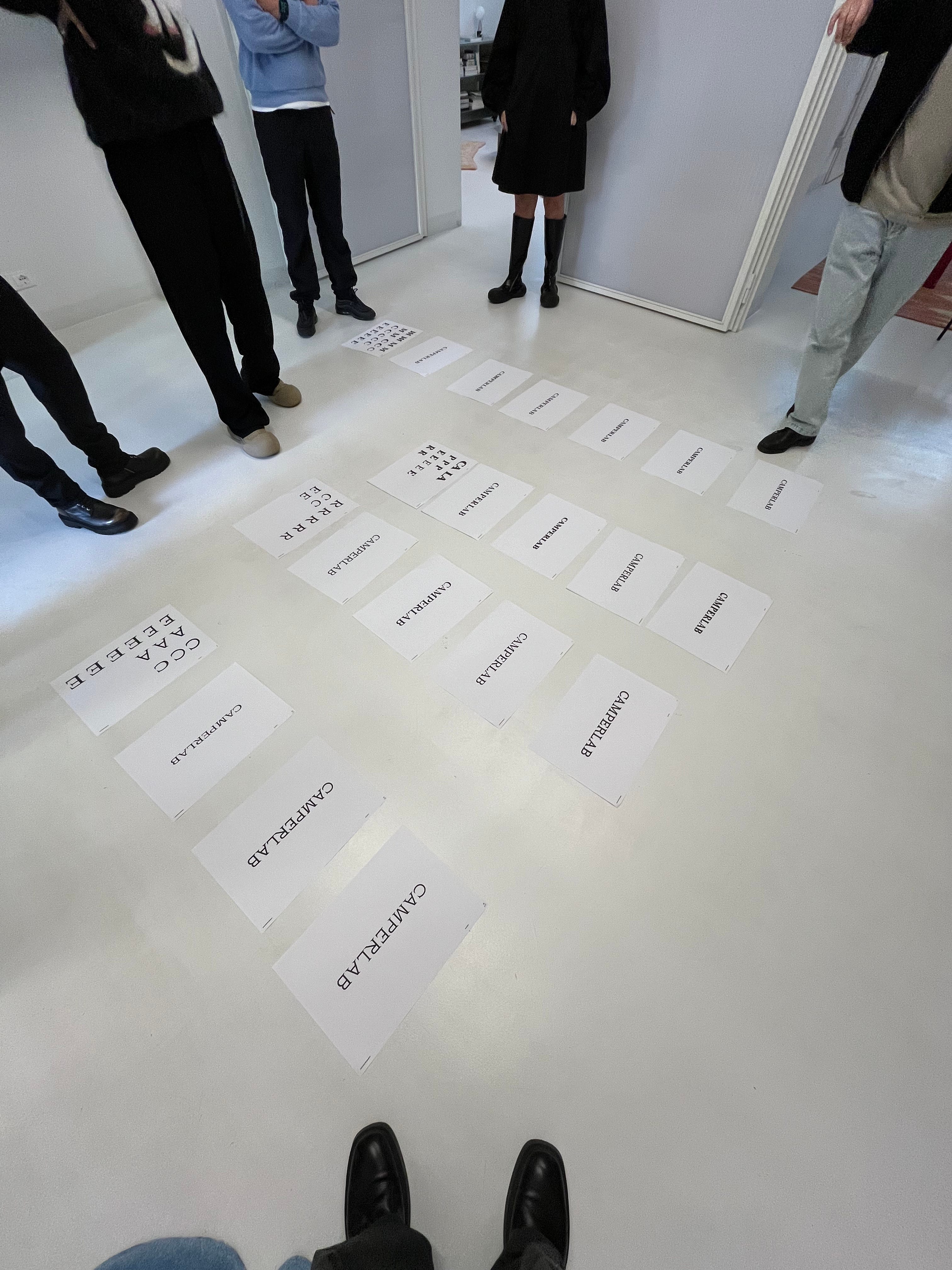
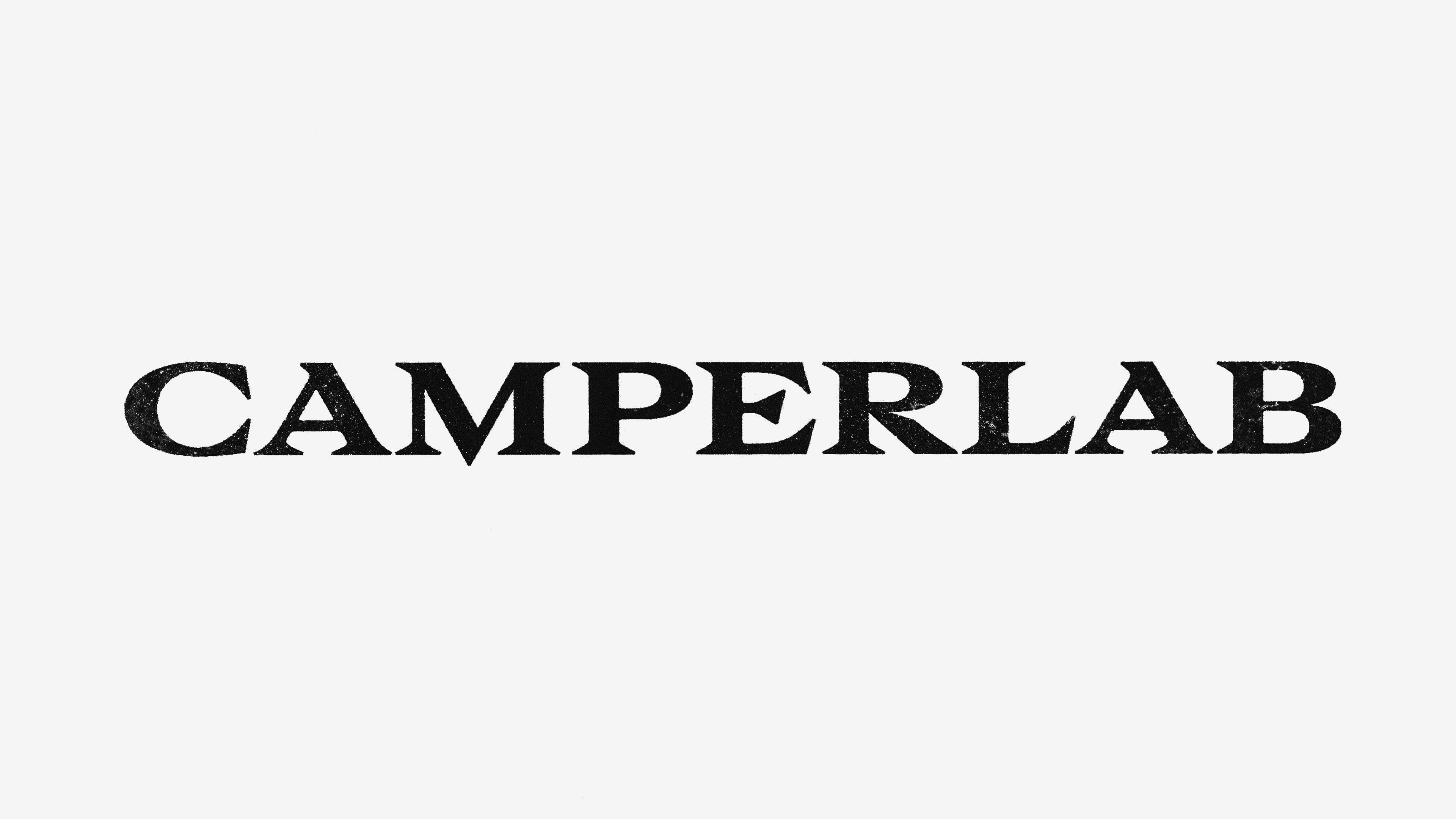
The logotype features a custom serif typeface, sharp, extended, and heavy in weight. It draws on the legacy of modern sharp serifs, combining bold contrasts with unexpected details that generate tension and movement. It’s unapologetically heavy. Never static. Never neutral.
It may sound like a cliché, but when we looked back at our earliest sketches, we realized that the proportions and core spirit of the final logo had emerged almost immediately. Most of the work was refining those forms, testing endless variations in weight, balance, and negative space.
We paid particular attention to the serifs, the very logo’s defining feature. Their elongated shapes and pointed terminals reflect the brand’s warped elegance.
In finding the right tone, we identified the letters M, E, and R as opportunities to embed distinctive elements. Once again: the sinister. That idea of something slightly “off”, and yet perfectly integrated into the structure. Just bold enough to command attention. The lower vertex of the M slightly goes beyond the baseline; the central arm of the E features a diagonal cut, echoing type design heritage; the R has a unique junction between the leg and the crossbar.
A mouth ready to strike
In fashion, the logotype and monogram often serve different, sometimes opposing, purposes. Monograms, in particular, function like talismans, encapsulating the essence of a brand: from Burberry’s iconic patterns to Prada’s triangle, Gucci’s interlocking Gs, and Chanel’s mirrored Cs.
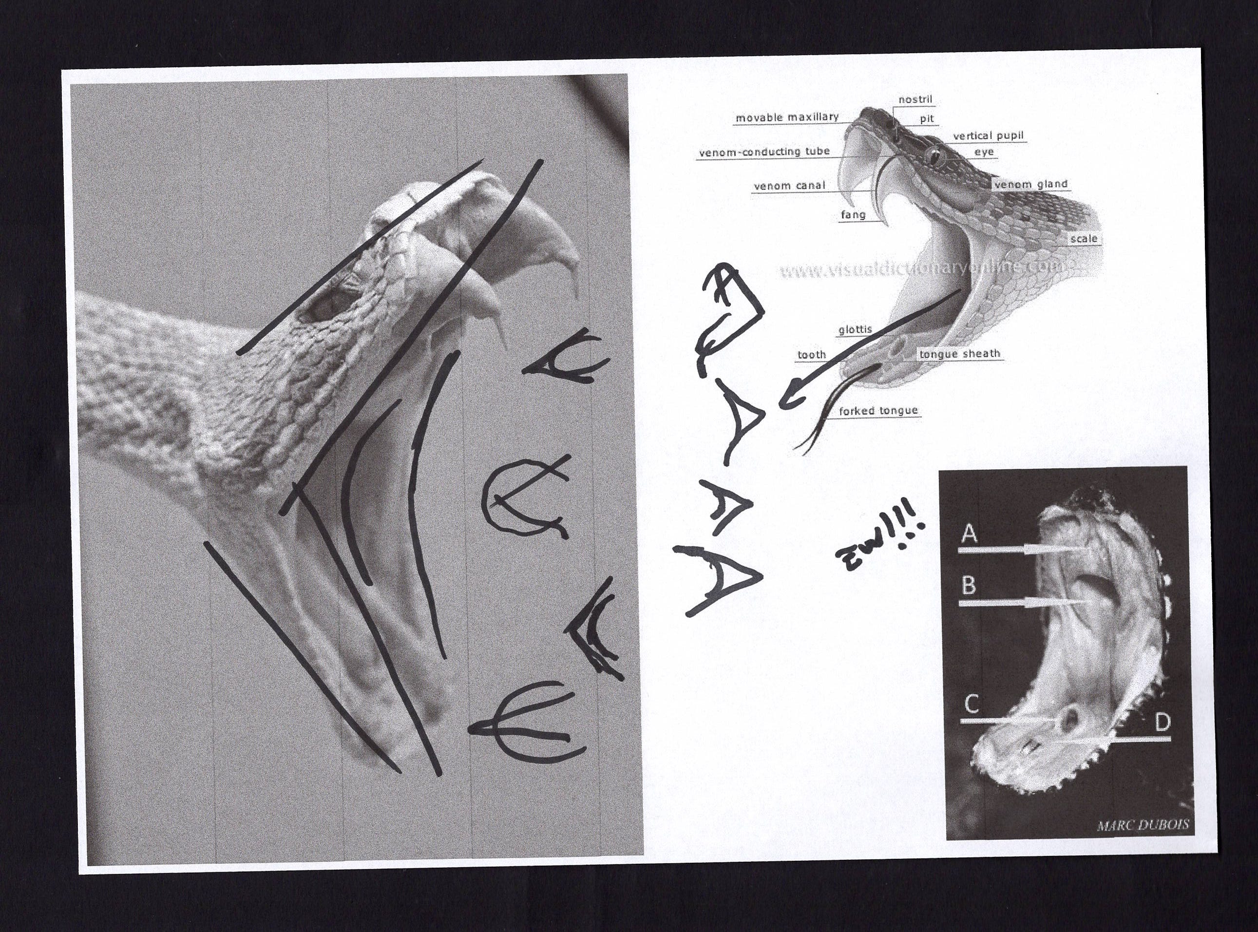
With this monogram, we wanted to go in a eerie direction. The reptile world offered plenty of inspiration, even veering into esoteric symbolism (another theme that emerged during discussions with Camperlab team).
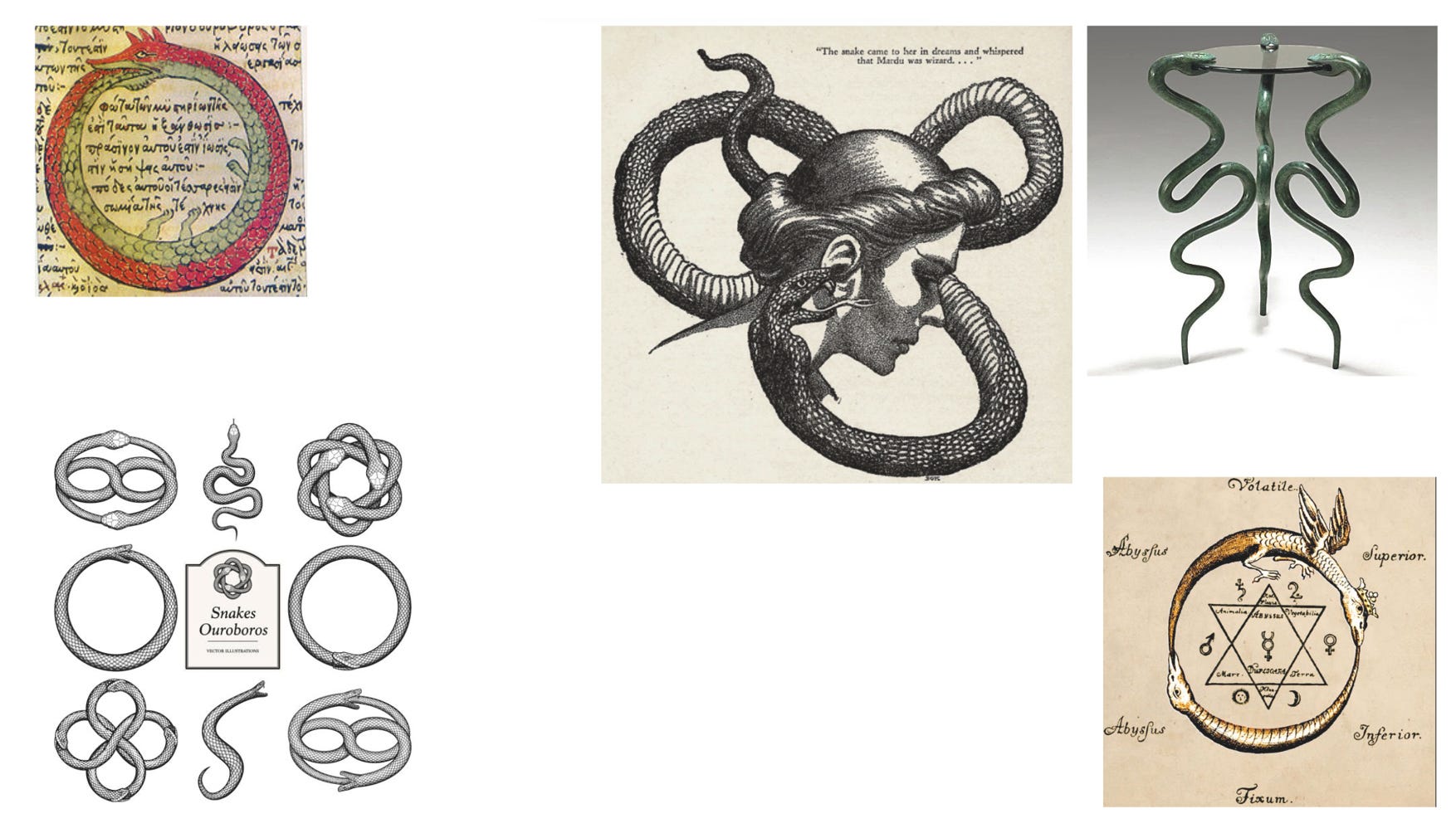
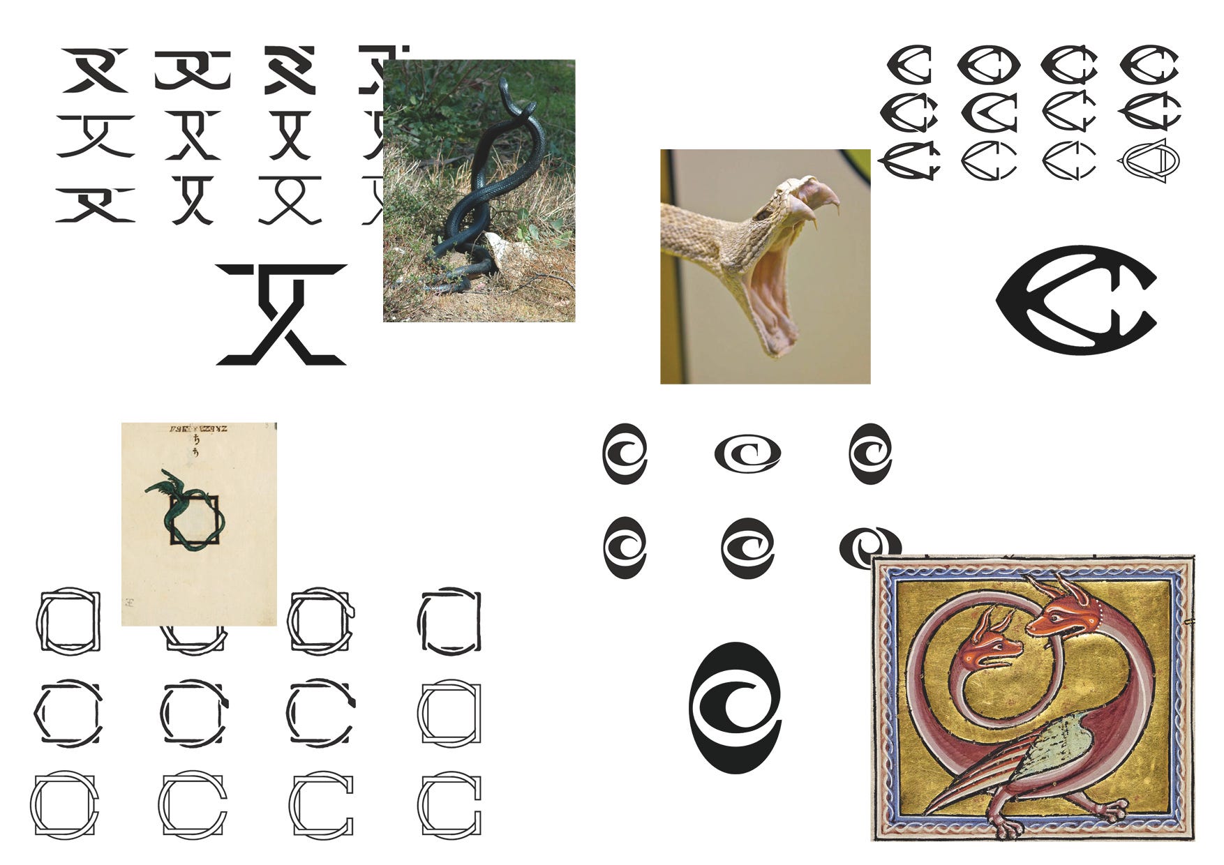
Here is where we crystallized the ambiguity that had guided us from the beginning. The final monogram is designed to feel alive. It opens like a snake’s mouth: fluid, symbolic, and ready to strike. It expresses all project’s dualities: style and danger, precision and unpredictability.
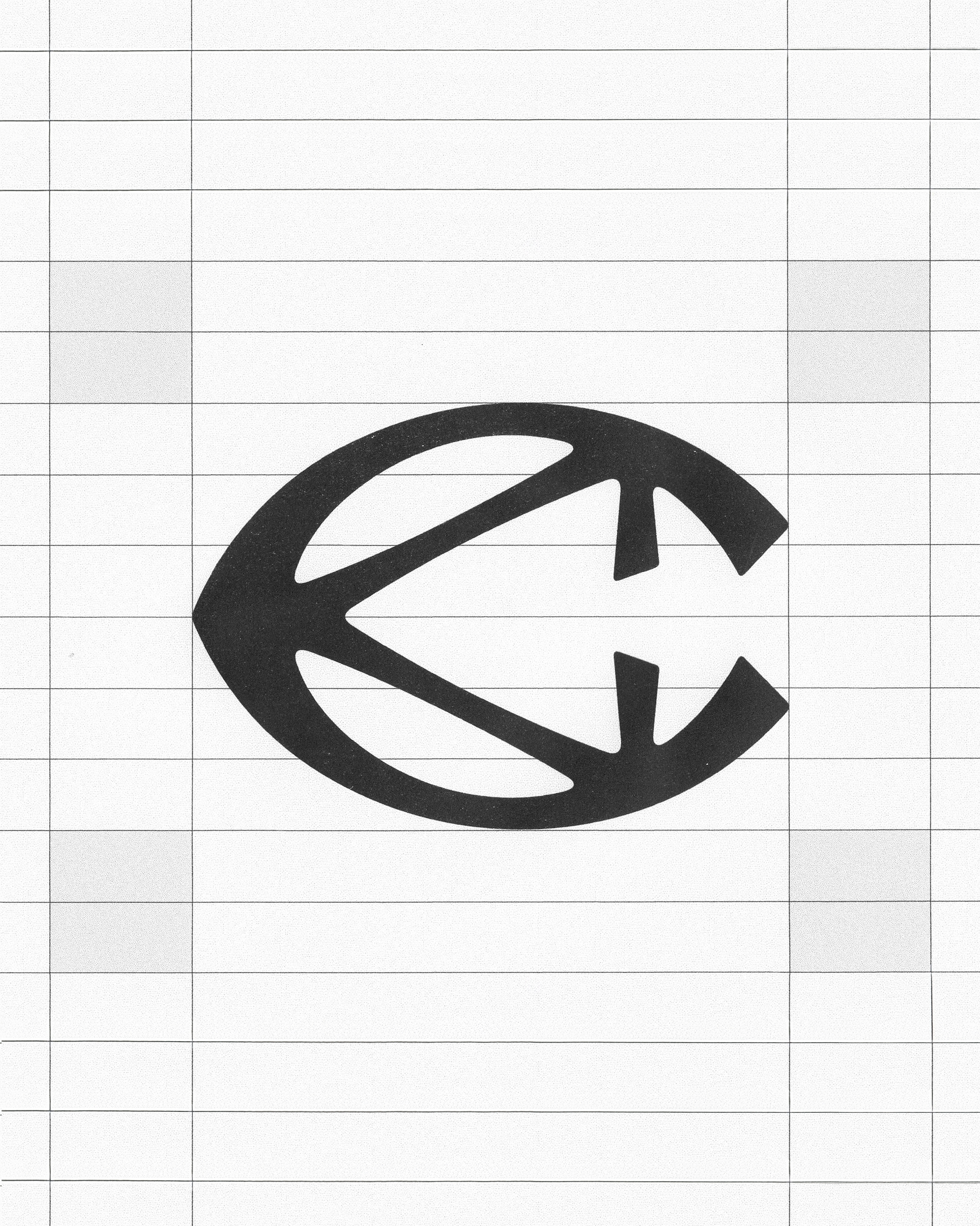


Somewhere between an open jaw and a cobra’s back pattern, the monogram unites two overlapping Cs. There are three visible points of tension and contact, pushing outward as if trying, once again, to twist, shed, and slither away.
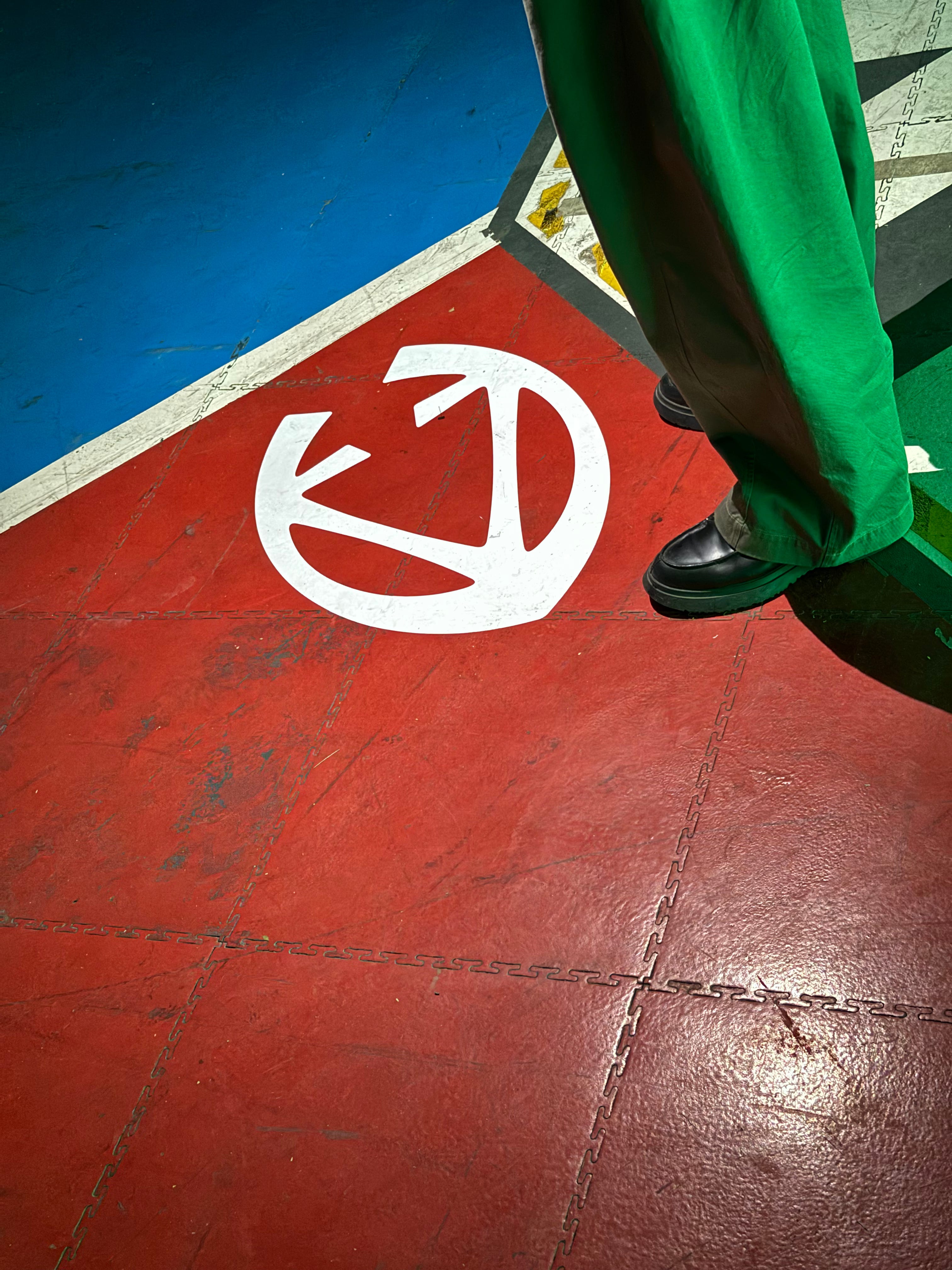
At the official debut of Camperlab at Paris FW we finally saw our work irl, mixing perfectly with the dark and alien-ish vibe of the moment. For a designer, there’s nothing more satisfying than seeing the leap from concept to finished product, so we found ourselves scanning the garments for logos: engraved, embossed, stitched, in metal, on leather, printed. A full spectrum of tactile translations.
It’s time to buy stuff!
Until recently, Camperlab didn’t have its own website: it lived as a section within Camper’s main platform. But with the brand’s new direction, it was time to cut the cord and give it a space of its own. We took care of the website design, aligning it closely with the new visual identity.
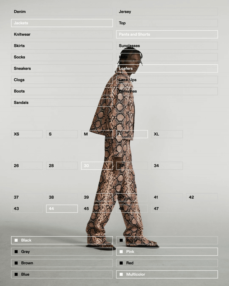
We embraced a deconstructed layout approach, with unconventional alignments and asymmetric compositions. This structure was paired with a strong focus on imagery, cut-out product shots and oversized visuals for editorial sections, resulting in a modern, minimalist design that puts images front and center.
The typeface chosen for the identity, ABC Diatype by Dinamo Typefaces, is used in a single size, in uppercase and with simple horizontal center alignments, contributing to layouts that feel clean, straightforward, and cohesive.
Hope you enjoyed :) 🐍
If you want to learn more about upcoming projects from Giga you can also follow us on Instagram and check our website.
A text by Alessandro De Vecchi, Senior Designer at Giga