#05 – The End of Aging
Introducing our first digital twin for Bid(s) for Survival, the series of exhibitions by Michael Schindhelm at Kulturstiftung Basel H. Geiger
The End of Aging is the first exhibition of the series Bid(s) for Survival by writer, filmmaker and curator Michael Schidhelm at Kulturstiftung Basel H. Geiger.
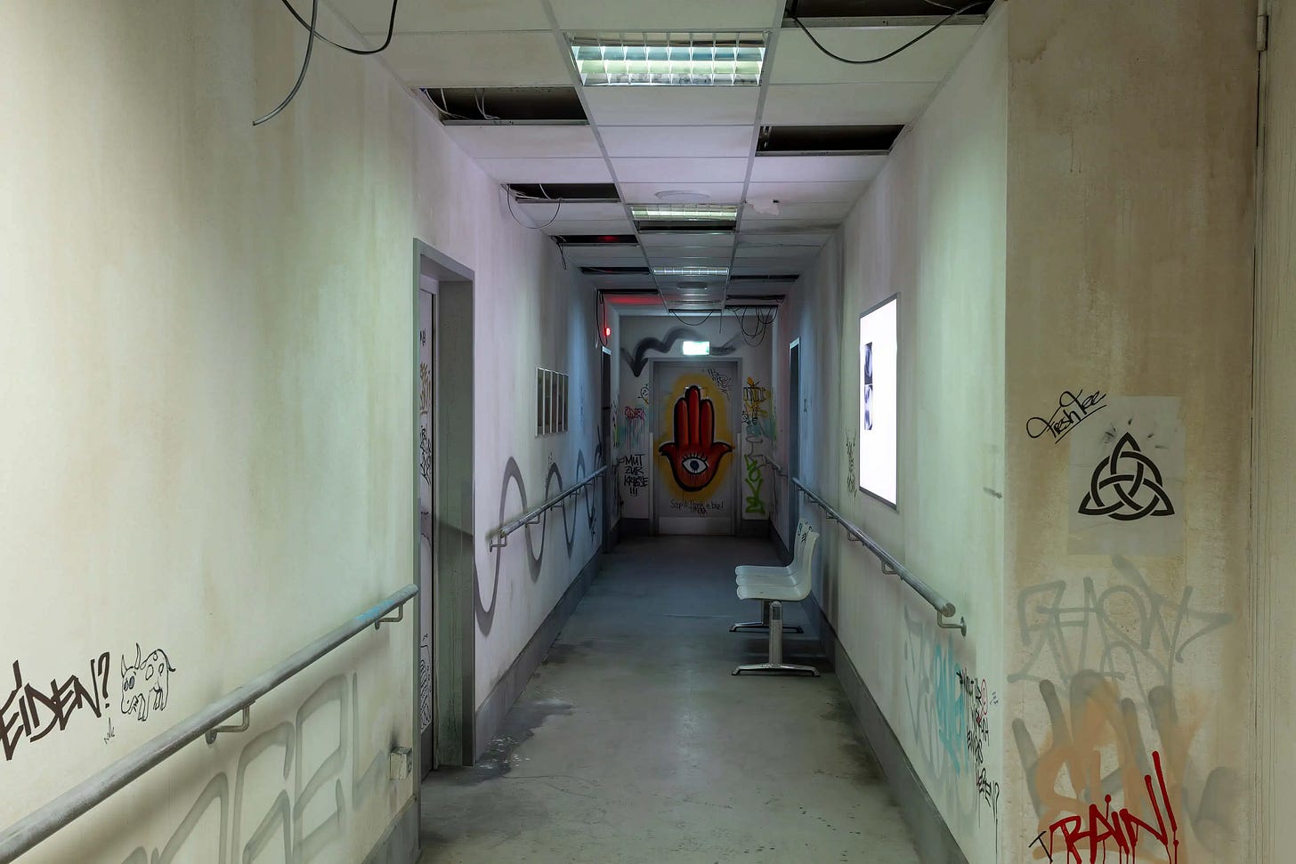
The show immerses the audience with an elaborate scenography made of film installations and science-based research, encouraging visitors to consider a world of super longevity and near-eternal youth.
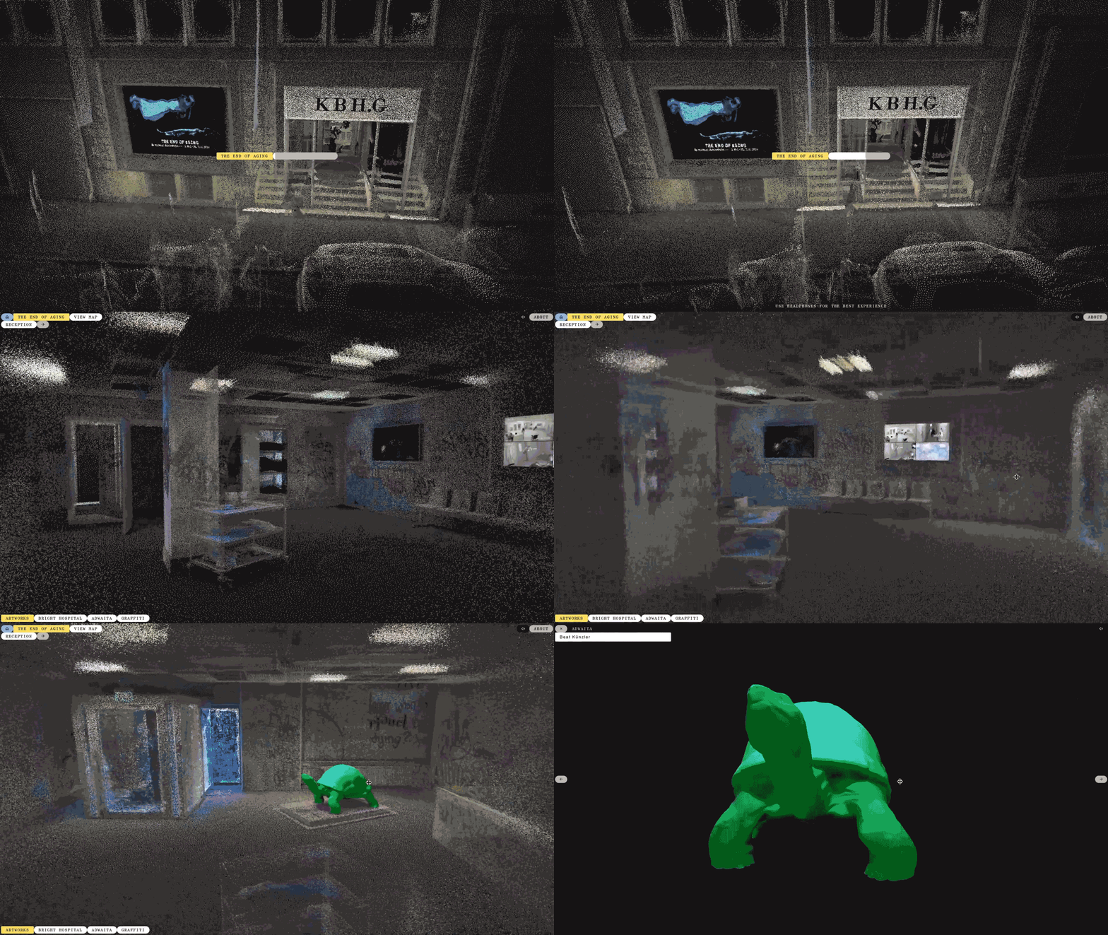
The art set brings you to a fictional abandoned hospital, consisting of seven rooms, with the possibility of following a linear narrative or moving with a map that takes the visitor directly to the rooms. Upon visiting each room the audience will be presented with an opening sequence, after which one can look around and click or tap on the artworks to enjoy them in detail. Have a try yourself.
Longevity is a desire as old as humankind. In the near future, we may have numerous ways to slow or even reverse aging, with some in proof-of-concept experiments and others already in human trials. The first anti-aging drugs could arrive within the decade, followed by a procession of therapies. Yet, the exhibition grapples with the social, economic, and cultural implications of longevity. Do we truly wish to live forever? How would society cope with people aged 150 or over? Is there a need to enact the right to die? These questions and more will be explored in this exhibition. Definite answers may be elusive, but with the aid of speculative fiction and insights from internationally acclaimed scientists, we may catch a glimpse of the possible future of longevity.
A making of
We worked with Michael from an early stage, with the idea of bringing the exhibition online as a digital twin, to give it a second life. Recreating the experience for web in Three.js was fun and sometimes challenging, especially optimizing for mobile devices. Here’s how we did it!
The setting
The set was designed by Giulio Margheri from OMA and Luca Moscelli from BUROMOSA, who kindly provided us with a 3D model of the whole floor plan in the early stages of the project. This enabled us to prototype the whole experience using temporary assets before the exhibition was even built. As soon as doors were opened to the public, we went to Basel to acquire all the files we needed for the release.
Point clouds
In computer graphics, the illusion of things is usually achieved by drawing lots of triangles which make the surface of a 3D object. For this project we mainly used point clouds instead.
First, each room was acquired using a LIDAR scanner with the help of Out of Ram. This cool machine spins a small mirror thousands of times per second, shoots millions of laser rays and finally outputs a cloud of colored dots that depicts the surrounding space. Each scan was then cleaned and reduced to one million points.
The last step is to draw all these dots on a screen; this is achieved with a shader, a piece of code that runs on the graphic processor unit of digital devices. Writing a custom shader allows us to define exactly how these points should appear, how they move and which effects are applied to them.
3D models
LIDAR scanning works great in digitalizing the overall shape and color nuances of a room, but it’s also time consuming and can’t fully capture some objects. So, to be on the safe side, we also scanned some of the scene props with a smartphone app. Some of the resulting 3D models were either converted in points and integrated in the LIDAR scans, or included as a textured mesh (see the Adwaita sculpture!)

Textures and reflections
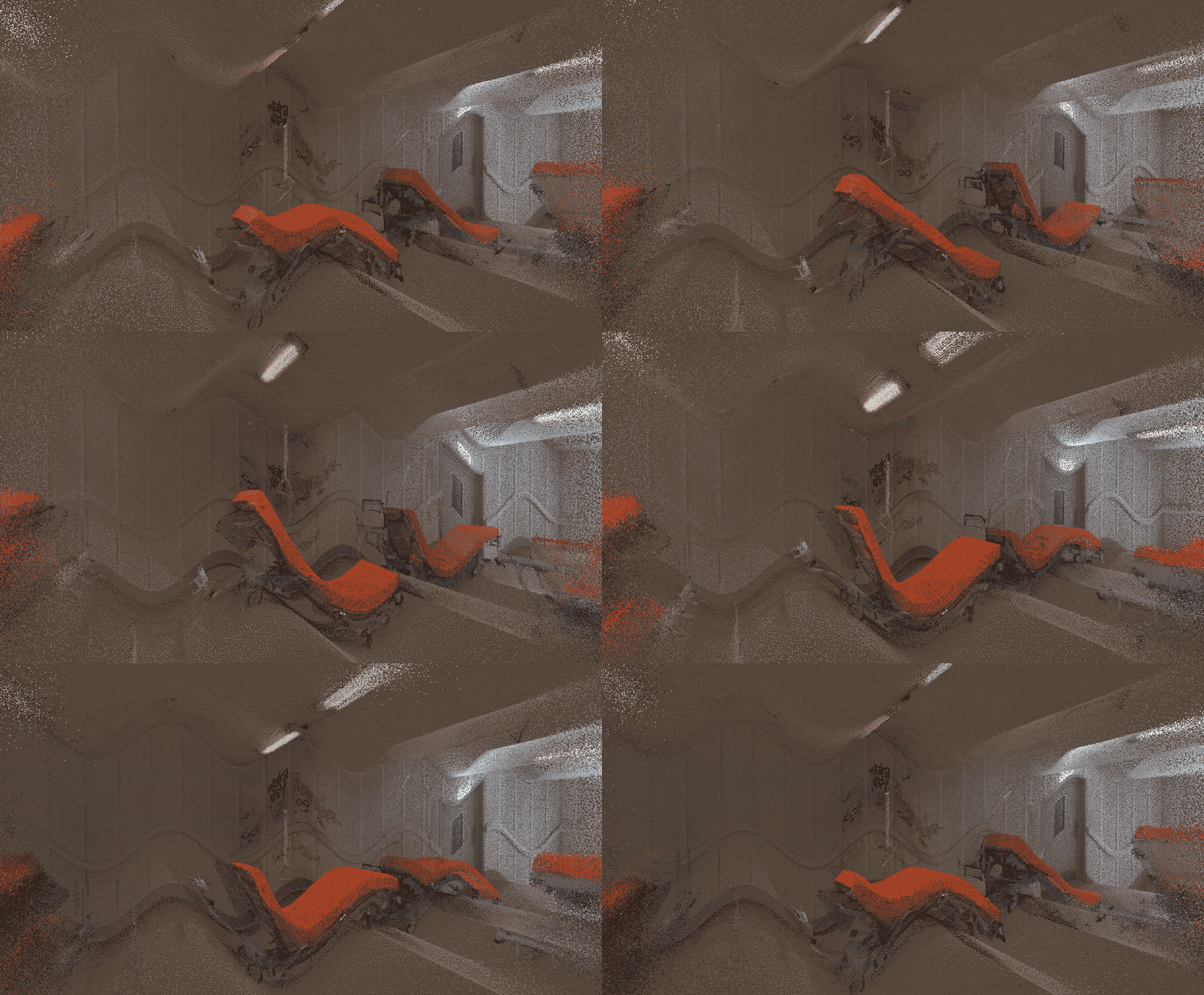
Point clouds are nice but they can’t always deliver the same level of detail of a picture. That’s why we sometimes enriched them with some semi-transparent images to improve the overall quality. One curious example is the Lab Room, where we duplicated images and videos along one axis to imitate an infinite mirror effect.
Video system
Videos were a core element of the original exhibition. Almost every room had one or more projection or display playing footage. However, not many devices can render multiple videos within a 3D scene. The workaround was to merge all the videos from each room into a single file; the collage is then mapped on a 3D model to give the illusion of many screens.
During our visit in Basel we had seen how some of the rooms were mainly lit by the projections themselves. This effect, known in computer graphics as emissive lighting, is usually too heavy to simulate in real time on mobile devices. Instead, our system pre-computes the average color for every frame of the video and saves it into a JSON file. Then, at runtime, the video timestamp is used to retrieve the correct color and diffuse it to the points nearby.
Lights
Imagine you are in an abandoned building. Suddenly one of the neon tubes starts to flicker: it could fail and leave you in the dark anytime soon. Eerie!
Wishing to recreate this feeling, we coded a custom system which simulates power fluctuations in the hospital’s electrical grid. The less power, the more flickering. This information is then used by the point cloud material, which darkens the closest points whenever a neon loses energy.
Integration
So far we described how we recreated different elements of the exhibition; putting all the pieces together in a cohesive web experience is a whole other story.
Behind the scenes, there are multiple systems at work and each one has a purpose; showing the 3D world, managing the user interface, animating the camera, showing the subtitles, starting or pausing videos etc. These systems — or “layers” — are autonomous but also need to work together. We achieved this by setting up a shared store, a sort of common ground trough which different libraries and systems can communicate by setting or getting data.
The store effectively ties everything together, allowing different layers of the website to speak to each other and ensure good usability. For example, the user interface layer and the 3D layer are interconnected; hovering an entity in the UI makes it glow in the digital world, and vice versa.
A special attention was given to routing management. We wanted to ensure a seamless navigation of the 3D world; at the same time, the website had to act as an archive, whose elements would be easily reachable and shareable if needed. Synchronizing Nuxt with the 3D visualization means we can control the routing so that every room or artwork is associated to its own web address.
Splash screen
The final step was creating a splash screen to entertain the visitors of our website while the exhibition is loading. We chose a scan of the façade of KBH.G which was then animated using a custom shader to suggest a slight breeze. This involved “painting” out the portions of the cloud that are affected by the wind in different ways. At runtime individual points are then moved with math functions.

Here’s a nerdy trick if you develop with THREE.js; usually rendering a scene during a loading is undesirable, since the renderer will freeze while models are decompressed and loaded on the GPU. This happens by default as soon as a model has been downloaded, so we extended the DRACOLoader class to delay these operations until the first transition starts. Quick and dirty, but works!
The End of Aging took place from May 3rd to July 21st at Kulturstiftung Basel H. Geiger. You can now visit it online at bidsforsurvival.com.
A text by Matteo Garagiola, Creative Technologist at Giga


